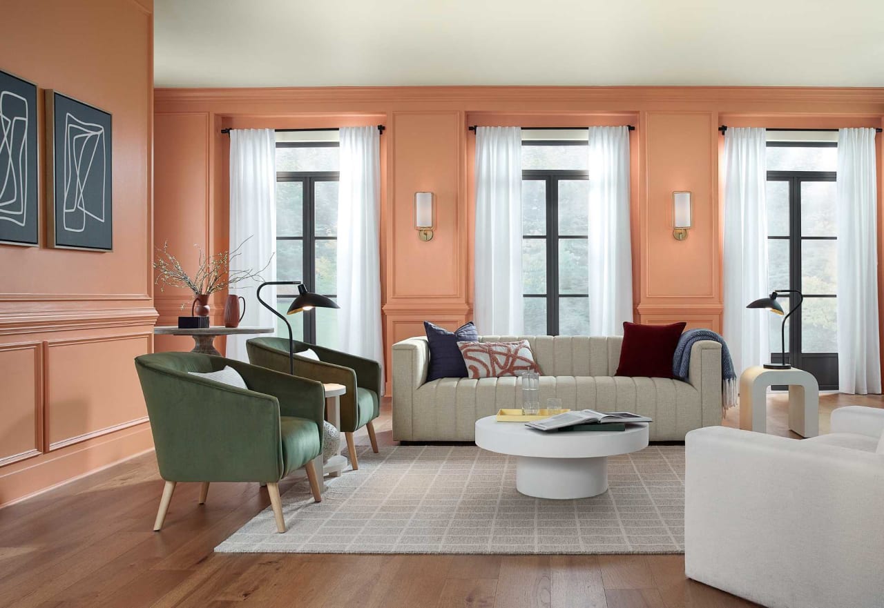
Rich evocative tones have taken center stage for interior paint colors of choice in 2023. The era of grey is behind us. 2021 saw a shift toward warm, earthy neutrals, 2022 put emphasis on happy-go-lucky greens, and everything speaks to the comfort we’ve found at home, along with our own self-expression, “We are rebounding from difficult times with a flood of creative expressions that provide escape, connection, comfort and survival—all at once—inspiring us to design new spaces that pull from the best of everything ever,” says Sara McLean, color expert and stylist at Dunn-Edwards.
Looking ahead to 2024, earthy, nature-inspired tones will still be big, according to the color experts that release their predictions each fall. Here are all the picks so far:
Bay Blue by Minwax
Whether you're going for a breezy, coastal feel or more of a moody, sophisticated aesthetic, Minwax's Bay Blue stain does it all. Ocean-inspired shades have risen in popularity lately—a trend that's no doubt inspired by the coastal grandmother aesthetic that's sweeping home design right now.
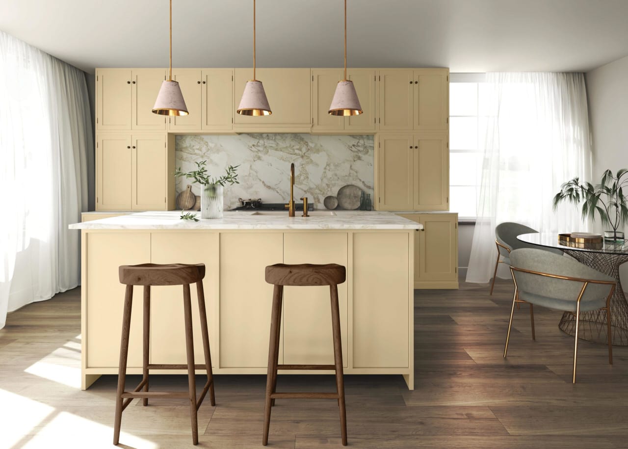
Limitless by Glidden
Glidden's color of the year is a warm, nearly-yellow neutral that can be paired with almost any color scheme. The color experts at Glidden call Limitless an “anything-but-yellow honey beige," and say it was designed to blend with both warm and cool tones—though they're embracing the warm-tone trend. "This modern neutral is as adaptable as its name implies and is taking the place of cool neutral tones that are so last year,” said Ashley McCollum, color expert for Glidden, in a press release.
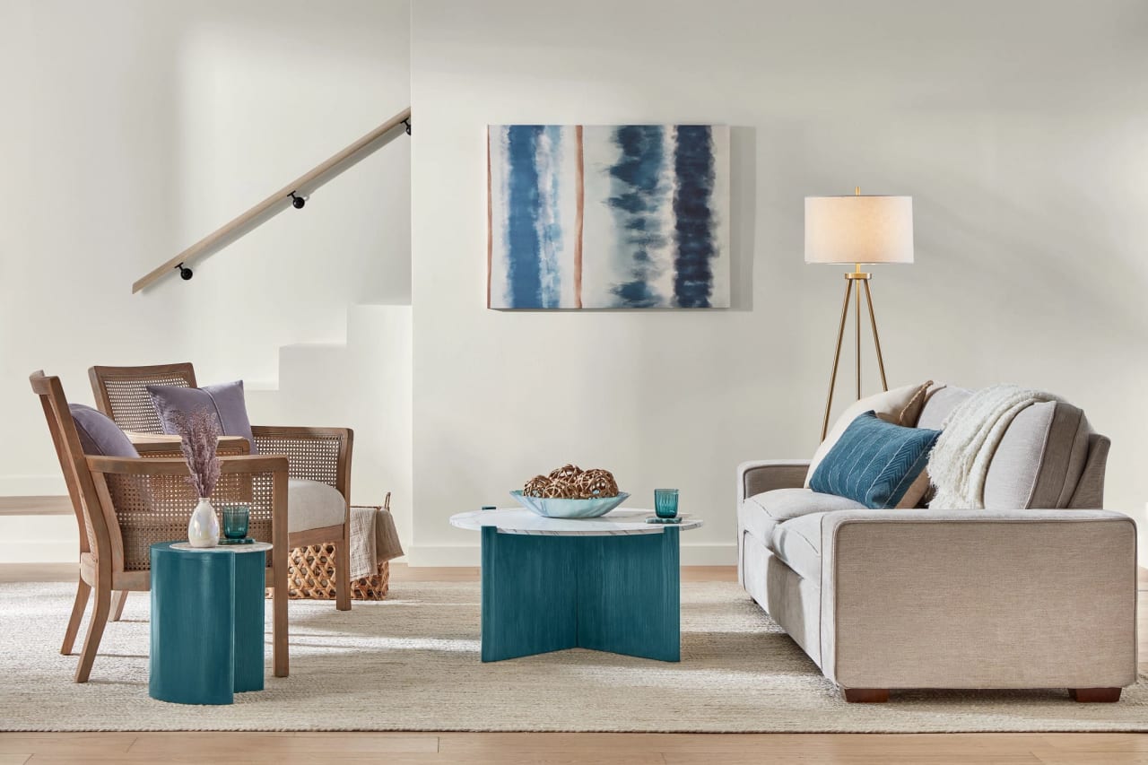
Renew Blue by Valspar
Shades of blue proved popular in homes for the past few years, and the plucked-from-nature hue shows no signs of slowing down. Valspar's pick for 2024 color of the year is Renew Blue (8003-37D), a calming, meditative shade of soft sky blue.
Cracked Pepper by Behr
Behr's color of the year is Cracked Pepper (PPU18-1), a deep almost-black charcoal hue. The moody shade adds sophistication to any space. "We recognize the growing desire for using darker colors throughout spaces," said Jodi Allen, global chief marketing officer at Behr Paint Company, in a press release. "Adding a soft black like Cracked Pepper evokes a sense of confidence and individuality that we want all of our customers to feel after completing a project."
Persimmon by HGTV Home by Sherwin-Williams
Cheery Persimmon (HGSW6339) is designed to bring lightness and energy to the gathering spaces of your home. It's bright without being overwhelming, thanks to neutral, pastel-like undertones that provide a warm, welcoming feel.
Ironside by Dutch Boy
Embrace the moody paint color trend with Ironside (422-7DB) by Dutch Boy. The deep olive shade is a grounding yet statement-making neutral that's perfect for cozy lounge spaces—think bedrooms, dens, and living rooms. "We're taking a comforting approach; embracing restoration and nature, while bringing harmony into the home," said Dutch Boy's senior brand manager Michelle Bangs in a press release.
#purewow #glidden #HGTV #sherwinwilliams #behr #minwax #dutchboy #valspar #crackedpepper #persimmon #ironside #renewblue #bayblue #limetless #paintcoloroftheyear #betterhomesandgardens #interiordesign #colorinspo #interiors #paint #realestate #colortrends